生命不息,折腾不休。从搭建 blog 以来,博文虽没有写几篇,但折腾的时间花了不少,走过了不少弯路,也踩过了不少的坑,虽然很懒,但本着好记性不如烂笔头的宗旨,打算在折腾记忆尚未磨灭之际记录一下走过的路和踩过的坑…
接着前两篇使用 Hexo 基于 GitHub Pages 搭建个人博客之上,本文记录了在使用非常漂亮简洁的 Next 主题过程中的各种折腾,其它主题的相关设置大同小异。再次衷心的感谢 Hexo 的作者和 Next 主题作者的无私奉献。
一、主题基本配置 记录一下 Next 主题的基本配置、设置「阅读全文」、关闭新建页面的评论功能、页面文章的篇数、宽度调节、设置「JavaScript 第三方库」等内容、在线字体替换(选择关闭,加快访问速度)
1.1 主题安装 Next 主题安装与所有 Hexo 主题安装一样。当克隆或者下载(Next主题GitHub地址 )完成主题文件后,拷贝至站点目录的 themes 目录下,一般命名为 next,打开站点配置文件, 找到 theme 字段,并将其值更改为 next 即可。
1.2 Next 主题宽度调节 编辑 themes/next/source/css/_variables/custom.styl 文件,新增变量:
1
2
3
4
5
// 修改成你期望的宽度 $content -desktop = 700px// 当视窗超过 1600px 后的宽度 $content -desktop-large = 900px
以上方法不适用 Pisces Scheme
Pisces Scheme 编辑 themes/next/source/css/_schemes/Picses/_layout.styl 文件,更改以下 css 选项定义值:
1
2
3
.header { width : 1150px ; }.container .main-inner { width : 1150px ; }.content-wrap { width : calc (100% - 260px ); }
二、多说评论 2.1 安装多说 注册多说 ,登录后在首页选择 “我要安装”。
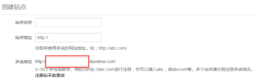
2.2 创建站点 按要求填写如下图所示表单:
注意: 多说域名 这一栏填写的即是你的 duoshuo_shortname,在下一步主题配置中需要使用到。
2.3 主题配置多说 创建站点完成后,在 主题配置文件 中新增 duoshuo_shortname 字段,值设置成上一步创建站点中填写的 多说域名 即可。
2.4 开启多说热评文章 在 主题配置文件 中,设置 duoshuo_hotartical 配置项的值为 true,即可开启多说热评文章。
2.5 多说评论样式调整 登录多说 后,在首页右上角点击“后台管理”,选择站点名称打开多说后台管理页面,选择“设置”下拉找到“自定义CSS”输入框,填写以下CSS样式,效果参考本站文章结尾评论样式。
1
2
3
4
5
6
7
8
9
10
11
12
13
14
15
16
17
18
19
20
21
22
23
24
25
26
27
28
29
30
31
32
33
34
35
36
37
38
39
40
41
42
43
44
45
46
47
48
49
50
51
52
53
54
55
56
57
58
59
60
61
62
63
64
65
66
67
68
69
70
/*-------------访客底部----------------*/ .ds-recent-visitors { margin-bottom: 200px; } @media (max-width: 768px) { .ds-recent-visitors { margin-bottom: 440px; } } /*-------------非圆角----------------*/ #ds-reset .ds-rounded { border-radius: 0px; } .theme-next #ds-thread #ds-reset .ds-textarea-wrapper { border-top-right-radius: 0px; border-top-left-radius: 0px; } .theme-next #ds-thread #ds-reset .ds-post-button { border-radius: 0px; } .ds-post-self xmp { word-wrap: break-word; } /*-------------访客----------------*/ #ds-reset .ds-avatar img, #ds-recent-visitors .ds-avatar img { width: 54px; height: 54px; /*设置图像的长和宽,这里要根据自己的评论框情况更改*/ border-radius: 27px; /*设置图像圆角效果,在这里我直接设置了超过width/2的像素,即为圆形了*/ -webkit-border-radius: 27px; /*圆角效果:兼容webkit浏览器*/ -moz-border-radius: 27px; box-shadow: inset 0 -1px 0 #3333sf; /*设置图像阴影效果*/ -webkit-box-shadow: inset 0 -1px 0 #3333sf; -webkit-transition: 0.4s; -webkit-transition: -webkit-transform 0.4s ease-out; transition: transform 0.4s ease-out; /*变化时间设置为0.4秒(变化动作即为下面的图像旋转360读)*/ -moz-transition: -moz-transform 0.4s ease-out; } /*-------------访客悬浮在头像----------------*/ #ds-reset .ds-avatar img:hover, #ds-recent-visitors .ds-avatar img:hover { box-shadow: 0 0 10px #fff; rgba(255, 255, 255, .6), inset 0 0 20 px rgba(255, 255, 255, 1); -webkit-box-shadow: 0 0 10px #fff; rgba(255, 255, 255, .6), inset 0 0 20 px rgba(255, 255, 255, 1); transform: rotateZ(360deg); /*图像旋转360度*/ -webkit-transform: rotateZ(360deg); -moz-transform: rotateZ(360deg); } #ds-thread #ds-reset .ds-textarea-wrapper textarea { background: url(http://ww4.sinaimg.cn/small/649a4735gw1et7gnhy5fej20zk0m8q3q.jpg) right no-repeat; } #ds-recent-visitors .ds-avatar { float: left } /*-------------隐藏版权----------------*/ #ds-thread #ds-reset .ds-powered-by { display: none; }
三、统计 我使用 LeanCloud 统计文章阅读数,使用不蒜子统计站点的 PV 和 UV 数。
3.1 文章阅读次数统计(LeanCloud) 参考为NexT主题添加文章阅读量统计功能
3.2 不蒜子统计站点访问统计 编辑 主题配置文件 中的 busuanzi_count 的配置项,配置以下内容:
1 2 3 4 5 6 7 8 9 10 11 12 13 14 15 16 17 enable : true site_uv: true site_uv_header: <i class="fa fa-user" ></i> site_uv_footer: site_pv: true site_pv_header: <i class="fa fa-eye" ></i> site_pv_footer: page_pv: false page_pv_header: <i class="fa fa-file-o" ></i> page_pv_footer:
site/page_pv/uv_header 和 site/page_pv/uv_footer 为自定义样式配置,相关的值留空时将不显示,可以使用(带特效的)font-awesome。
4.1 安装 hexo-generator-feed 在站点的根目录下执行以下命令:
1 $ npm install hexo-generator-feed --save
编辑 站点配置文件,新增以下内容到任意位置:
1 2 3 4 5 6 7 8 9 plugin: - hexo-generator-feed feed: type : atompath: atom.xml limit : 20
五、内容分享 使用 JiaThis 作为内容分享服务,具体步骤如下:
编辑 站点配置文件, 添加字段 jiathis,值为 true 即可。
六、搜索服务 6.1 安装 hexo-generator-search在站点的根目录下执行以下命令:
1 $ npm install hexo-generator-search --save
6.2 启用搜索编辑 站点配置文件,新增以下内容到任意位置:
1
2
3
search: path: search.xml field: post
在站点的根目录下执行以下命令:
1 $ npm install hexo-generator-searchdb --save
6.4 启用搜索 编辑 站点配置文件,新增以下内容到任意位置:
1
2
3
4
5
search: path: search.xml field: post format: html limit : 10000
七、背景效果 介绍博客背景动态效果图和点击小红心效果的相关设置。
7.1 添加 JS 文件 把 js 文件 love.js 和 particle.js 放在\themes\next\source\js\src文件目录下。
7.2 引用添加的 JS 文件 更新\themes\next\layout\_layout.swig文件,在末尾(在前面引用会出现找不到的bug)添加以下 js 引入代码:
1 2 3 4 <script type ="text/javascript" src ="/js/src/particle.js" > </script > <script type ="text/javascript" src ="/js/src/love.js" > </script >
八、图片模式 8.1 新建博文 新建博文,设置type: "picture",使用{\% gp x-x \%} ... {\% endgp \%}标签引用要展示的图片地址,如下所示:
1
2
3
4
5
6
7
8
9
10
11
12
13
14
15
16
--- title: Naruto-Pictures categories: [图片] tags: [picture,naruto] date: 2016-09-02 14:36:04 keywords: picture,naruto type : "picture" top: 999 --- {% gp 5-3 %}     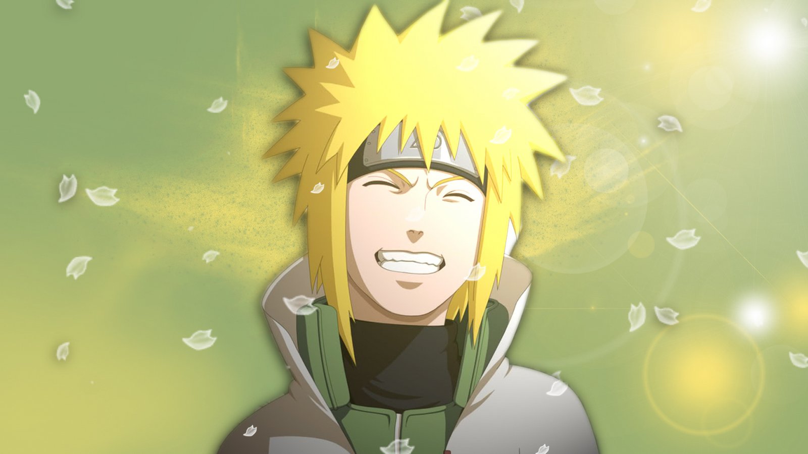 {% endgp %}
8.2 图片展示效果 {\% gp 5-3 \%}:设置图片展示效果,参考 theme/next/scripts/tags/group-pictures.js 注释示意图。
8.3 修复图片展示 主题目前首页可以正常显示步骤 8.2 设置的图片效果,但是点击进入后显示效果丢失,所以需要修改一下文件 themes\next\source\css\_common\components\tags\group-pictures.styl 中的以下样式:
1
2
3
4
5
6
.page-post-detail .post-body .group-picture-column { // float: none; margin-top : 10px ; // width: auto !important; img { margin : 0 auto; } }
九、博文压缩 目前知道的有两个插件可以压缩博文,hexo-all-minifier 插件和 gulp 插件。hexo-all-minifier 插件虽然使用比较简单,而且可以压缩图片,但是发现对文章缩进(输入法全拼模式下按 Tab)不支持,所以暂时使用第二种压缩手段。
9.1 hexo-all-minifier 配置使用 安装 hexo-all-minifier,在站点的根目录下执行以下命令:
1 $ npm install hexo-all-minifier --save
hexo g 生产博文的时候就会自动压缩 HTML、JS、图片,详情参考插件介绍
9.2 gulp 插件配置使用 hexo 依赖 gulp 插件安装,在站点的根目录下执行以下命令:
1
2
$ npm install gulp -g $ npm install gulp-minify-css gulp-uglify gulp-htmlmin gulp-htmlclean gulp --save
在 package.json 同级目录下,新建 gulpfile.js 并填入以下内容:
1
2
3
4
5
6
7
8
9
10
11
12
13
14
15
16
17
18
19
20
21
22
23
24
25
26
27
28
29
30
31
32
33
34
var gulp = require ('gulp' );var minifycss = require ('gulp-minify-css' );var uglify = require ('gulp-uglify' );var htmlmin = require ('gulp-htmlmin' );var htmlclean = require ('gulp-htmlclean' );gulp.task('minify-css' , function ( return gulp.src('./public/**/*.css' ) .pipe(minifycss()) .pipe(gulp.dest('./public' )); }); gulp.task('minify-html' , function ( return gulp.src('./public/**/*.html' ) .pipe(htmlclean()) .pipe(htmlmin({ removeComments: true , minifyJS: true , minifyCSS: true , minifyURLs: true , })) .pipe(gulp.dest('./public' )) }); gulp.task('minify-js' , function ( return gulp.src('./public/**/*.js' ) .pipe(uglify()) .pipe(gulp.dest('./public' )); }); gulp.task('default' , [ 'minify-html' ,'minify-css' ,'minify-js' ]);
生成博文是执行 hexo g && gulp 就会根据 gulpfile.js 中的配置,对 public 目录中的静态资源文件进行压缩。
十、博文置顶 10.1 修改 hexo-generator-index 插件 替换文件:node_modules/hexo-generator-index/lib/generator.js 为:generator.js
10.2 设置文章置顶 在文章 Front-matter 中添加 top 值,数值越大文章越靠前,如:
1
2
3
4
5
6
7
8
9
--- title: Naruto 图集 categories: [图片] tags: [picture,naruto] date: 2016 -09 -02 14 :36 :04 keywords: picture,naruto type: "picture" top : 10 ---
十一、头像圆形旋转 介绍一下实现头像圆形,鼠标经过旋转或者一直让旋转效果,主要是修改 Hexo 目录下 \themes\next\source\css\_common\components\sidebar\sidebar-author.styl 文件。
11.1 头像圆形修改 修改 sidebar-author.styl 文件中 .site-author-image CSS 样式如下:
1
2
3
4
5
6
7
8
9
10
11
12
13
.site-author-image { display : block; margin : 0 auto; padding : $site-author-image-padding; max-width : $site-author-image-width; height : $site-author-image-height; border : $site-author-image-border-width solid $site-author-image-border-color; border-radius : 80px ; -webkit-border-radius : 80px ; -moz-border-radius : 80px ; }
11.2 鼠标经过旋转修改 修改 sidebar-author.styl 文件,添加 CSS 样式 img:hover 如下代码:
1
2
3
4
5
6
img :hover { -webkit-transform : rotateZ (360deg ); -moz-transform : rotateZ (360deg ); transform : rotateZ (360deg ); }
修改 sidebar-author.styl 文件中 .site-author-image CSS 样式如下:
1
2
3
4
5
6
7
8
9
10
11
12
13
14
15
16
17
18
19
.site-author-image { display : block; margin : 0 auto; padding : $site-author-image-padding; max-width : $site-author-image-width; height : $site-author-image-height; border : $site-author-image-border-width solid $site-author-image-border-color; border-radius : 80px ; -webkit-border-radius : 80px ; -moz-border-radius : 80px ; box-shadow : inset 0 -1px 0 #333 sf; -webkit-transition : -webkit-transform 1.5s ease-out; -moz-transition : -moz-transform 1.5s ease-out; transition : transform 1.5s ease-out; }
11.3 头像循环旋转效果修改 修改 sidebar-author.styl 文件,添加如下代码:
1 2 3 4 5 6 7 8 9 10 11 12 13 14 15 16 17 18 19 20 21 22 23 24 25 @-webkit-keyframes play { 0% { -webkit-transform : rotateZ (0deg ); } 100% { -webkit-transform : rotateZ (360deg ); } } @-moz-keyframes play { 0% { -moz-transform : rotateZ (0deg ); } 100% { -moz-transform : rotateZ (360deg ); } } @keyframes play { 0% { transform : rotateZ (0deg ); } 100% { transform : rotateZ (360deg ); } }
修改 sidebar-author.styl 文件中 .site-author-image CSS 样式如下:
1
2
3
4
5
6
7
8
9
10
11
12
13
14
15
16
17
18
19
20
21
22
23
24
25
.site-author-image { display : block; margin : 0 auto; padding : $site-author-image-padding; max-width : $site-author-image-width; height : $site-author-image-height; border : $site-author-image-border-width solid $site-author-image-border-color; border-radius : 80px ; -webkit-border-radius : 80px ; -moz-border-radius : 80px ; box-shadow : inset 0 -1px 0 #333 sf; -webkit-animation : play 3s linear infinite; -moz-animation : play 3s linear infinite; animation : play 3s linear infinite; }
鼠标经过停止头像旋转:修改 sidebar-author.styl 文件,添加 CSS 样式 img:hover 如下代码:
1
2
3
4
5
6
7
8
9
10
img :hover { -webkit-animation-play-state :paused; animation-play-state :paused; }
完整 sidebar-author.styl 文件参考地址 。